The Illusive Jacket Design for Macom Farm
A few weeks before publication of Macom Farm, we were still working on the jacket design-author, jacket designer, book reviewers, editor, website designer, his wife, and my wife, as well-which might all seem like a creative confabulation, even enjoyable as a task of visualizing in art a captivating aspect of the story intended to become an irresistible pick-out-and-buy for readers visiting Amazon or Barnes & Noble and other outlets. Go ahead! Pick it up! What the cover promises, the book will deliver-and more!
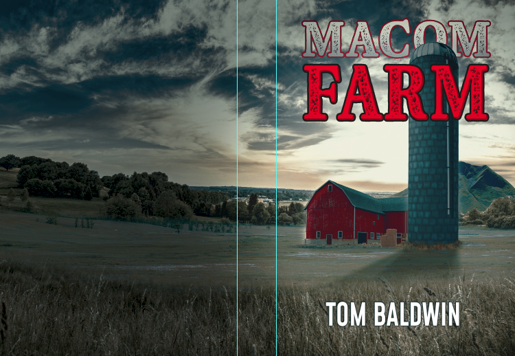 But it's not quite that simple, because everyone sees things differently. As the author-and, decidedly, not an artist-I have what I call an eagle eye of appreciation that means only that when it's right, I will know, and only then will I like it. That can be a hard-swallow for everyone else. The artist-the cover designer, in particular-for he's offering his creative skills to interpret his own design to illustrate the story and its theme. Although he is not the one who has sat for long hours staring at a computer screen attempting to describe accurately, a place or concept that does not exist, he has the job of compressing it into an irresistible image. The designer benefits from what has been written and how the theme is described, but he has not experienced the actual feel of living in the place-not like the author, who has lived there more personally than either the artist or even the reader ever will. How close they all come to the same visualization becomes a matter of how descriptively the words have been assembled. For example, in describing a farm, the word farm by itself may recall a rickety red barn filled with rusting implements next to a manure pile within sniff sight of a not-recently painted farmhouse-with a broad porch furnished with mismatched seating, and, perhaps, a second-hand refrigerator plugged into the ceiling socket. In another's mind, a farm may resemble the crisp manner of Amish estate farms, with their handsome barns and buildings and cattle herds grazing lazily in broad meadows that dot the landscape of Lancaster, Pennsylvania, where everything appears so well-manicured and serene that an artist might be at a loss to paint it better than a photo. And then, there are the mega-estate farms once surrounding Newport, in Rhode Island, the crisp linear vineyards of Napa and Sonoma, and the endless expanses of wheat and corn crops flowing away from huge, often blue and corrugated silos in Iowa.
So then, visualizing Macom Farm as being both uniquely beautiful and darkly sinister has put all our minds to the test. Criticism has been easy to come by and welcome to receive. First-
- "I don't like it."
- "It's good. It's okay, but I don't really like it..."
- "Way too sleepy when compared to what happens inside..."
 A step further on, though-constructive criticism has helped more.
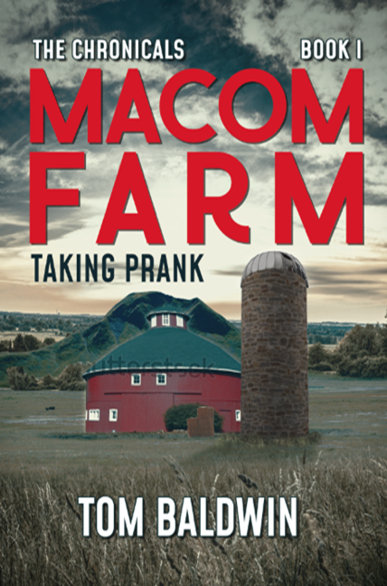
- "There should be more descriptive content on the cover."
- "What about the dagger? Isn't it the silent epicenter of the whole story?"
- "The silis totall, and the barn should be like in the book."
- "The hill behind the barn is in the wrong place."
- "Should there be a mist over the field?
- "If water is showing in the background, it shouldn't be there.
- "It needs thelp sell the book! Think of all the procative comic books you read as a kid.
- "Perhaps we should reconsider the concept."
Then, my son Greg intervened. "How about this, Dad?" Greg owns LostBearStudios.com. Well worth checking out.
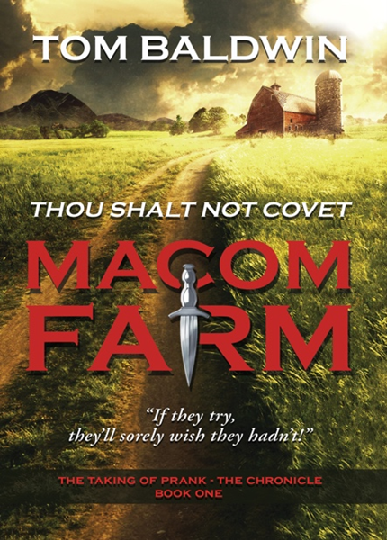
Here is the final!
We hope you will enjoy the read!